Forum Software Upgraded
I have an iPhone 8 with current standard apple phone software, no other add-one or mods.
Regarding screen real estate, it is in the overall layout of the new software. Lots of either information such as the member information above posts taking up space, or larger blank areas between information presented on the site. A way to describe the user experience would be much more scrolling to get to the same information that we use to get to on site pages compared to the prior software iteration.
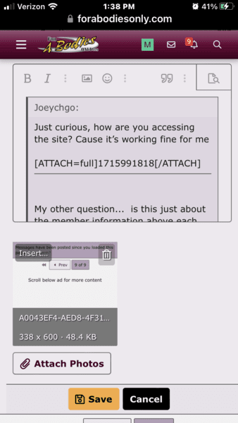
Here are a couple of examples. In these screen captures.
Above is the ongoing thread, and below is the reply window that I am currently writing this to you in. You will note here is a big gap of blank space between the two areas.
Second one showed how a huge amount is of the phone screen space is taken up by stuff other than the response edit window, which is where you want max real estate to make it easier to type the message information, all the other stuff ideally would be much smaller.