Stop in for a cup of coffee
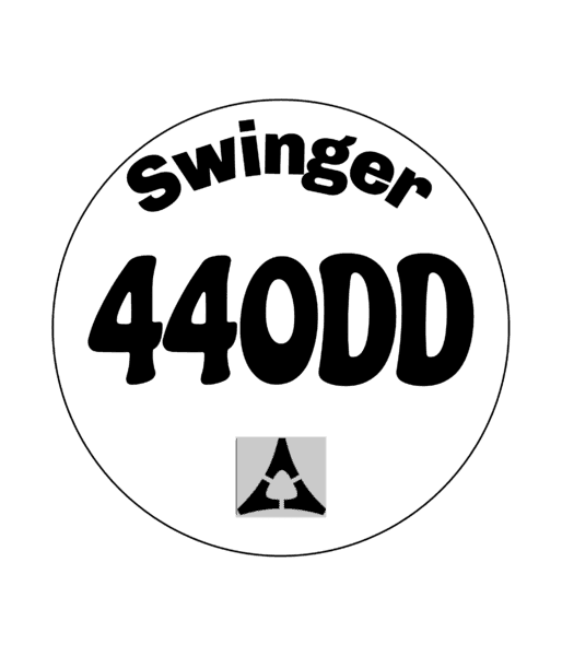
Maybe if the letter spacing was wider it would read easier.
Swinger reads easily in #2 and that makes the 440DD a bit easier.

I think that lettering is harder to read although very similar some of fonts used in ads late 60s early 70s
Maybe if the letter spacing was wider it would read easier.
Swinger reads easily in #2 and that makes the 440DD a bit easier.