"Home-Brewed" 1967 Dodge Window Sticker

-

"Dart67"

Well-Known Member
Joined
Jan 7, 2012
Messages
646
Reaction score
588
Location
Jessieville, Arkansas
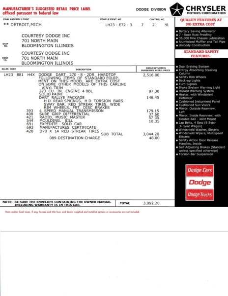
This has been my project for the last couple of days.

Yes, Days. It takes a great deal of time and patience to do this.

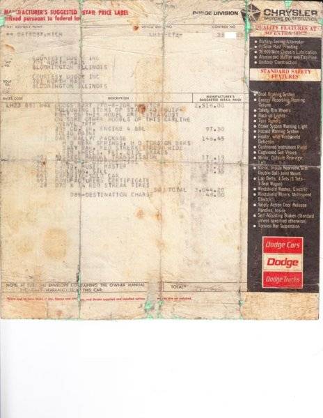
I have my ORIGINAL Window Sticker for my blue Dart that I bought new and took delivery on May 3, 1967.
It is in pretty rough shape any more after being folded and un-folded many, many time and kept in the glove box of the car for years and years.

SO, I decided to redo it.

Here is the Original and my "Home-Brewed" "NEW" window sticker that is the result of all my hard work using MS Paint.

Herb
WindowSticker RESIZED.jpg


WindowSticker_NEW RESIZED.jpg
 
Well done! I like the original cuz it is the original, but I understand and you did a great job!
Weathered look on old stuff i like.
 
Nice work!

I did one for my ‘69 GTS the same way using photoshop. It takes dozens of hours to get it right!
 
I'd put the original one in a frame. Its got "patina" . Thrn use your repop in the window at shows.
 
Last edited:
Here's a bit bigger one for comparison. Right off I see the font is different....

View attachment 1715219790
View attachment 1715219791

My slow Internet connection kept your attachment from showing on your 1st post.
But it is now. Sorry...
They look pretty much the same.
Finding the correct fonts to use is/was the biggest problem.

I had to "Re-build" the red fonts at the top left pretty much a pixel at a time.

I looked all around trying to find a font that looked like the old teletype print with no luck so far.

Herb
No worries....your's looks great, and would probably "fool" 99% of car show "lookers". I might have attempted to do what you did if I hadn't found those guys' site (I took the easy way out!)
 
The correct font usually makes or breaks the "correctness look".
Have a look at using the 'OCR-B' font. Might be a close match.

I've doing design and layout work for some 25+ years. Starting from scratch, a layout like this would take about 1/2hr to max 1 hour to recreate as a near perfect copy.
 
The correct font usually makes or breaks the "correctness look".
Have a look at using the 'OCR-B' font. Might be a close match.

I've doing design and layout work for some 25+ years. Starting from scratch, a layout like this would take about 1/2hr to max 1 hour to recreate as a near perfect copy.

Thanks for the suggestion. I just downloaded OcrB Regular Font and gave it a try.

Here is an example of the original font that I am trying to match and the OcrB font.

Any an all help would be appreciated.

Herb

FONT EXAMPLE.jpg
 
The original font looks slightly 'wider'.
Also, make the font appear in a grayish tint, instead of 'perfect' black. Adds some more 'vintage'. :)
 
Thanks for the suggestion. I just downloaded OcrB Regular Font and gave it a try.

Here is an example of the original font that I am trying to match and the OcrB font.

Any an all help would be appreciated.

Herb

View attachment 1715219810
I used that font when I did mine and then converted the text to an image and stretched it slightly wider and it became a nearly perfect match. The tricky part is that each letter requires a different amount of stretch to get it to look best.
 
-
Back
Top